Cisco's STIC website
Cisco's STIC department needed a UX and Web Design within brand and internal technology guidelines.

Created LOGO within Cisco Brand Guidelines.
Client: STIC (Services Technology Incubator Center)
Problem: The STIC site was not a seemless experience for those wanting understand what the organization does, ideation submission, or project status. News was mixed with projects. Few clicked past the front page.
STIC is an internal Incubator at Cisco. Employees are encouraged to submit project ideas, have them mentored, pitched during a “Shark Tank” to senior management, and if approved put into production. Completed projects are then handed over to other groups for maintenance.

Old STIC website
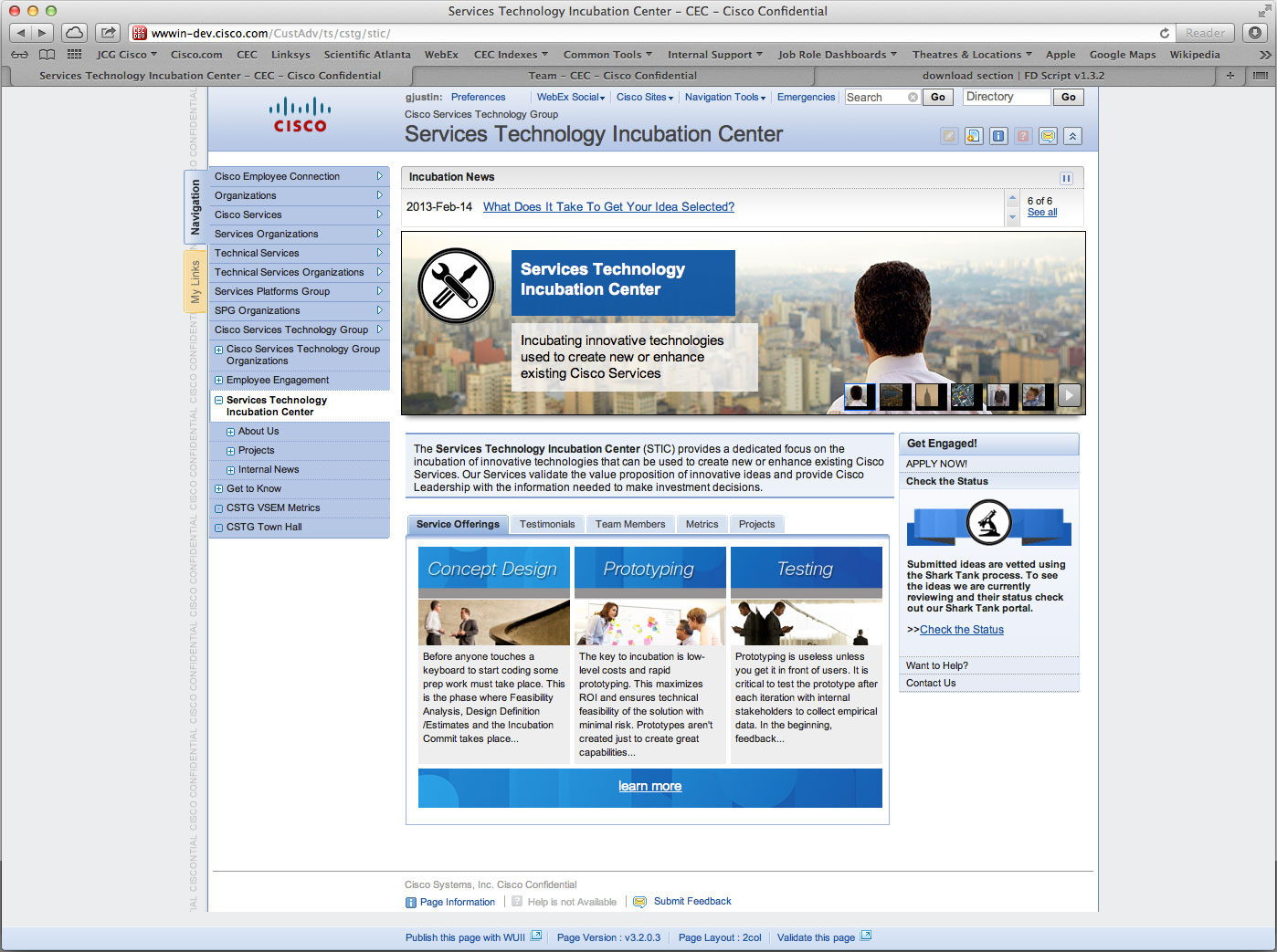
New STIC site
After researching Cisco brand standards, approved web assets, and reviewed all the copy, I suggested seperating News and services. STIC averages two press release a month, so not news heavy. News has it’s own section.
A jquery rotator cycles through products and services.
Dead center is the mission statement defining what drives STIC.
A tab structure shows the life cycle of incubation. The tab labels are: Services
Offered (What STIC Does), Testimonials (STIC accomplishments), Team Members (Who to contact),
Offered (What STIC Does), Testimonials (STIC accomplishments), Team Members (Who to contact),
Metrics (Status updates), and Projects (open and closed).
By bringing the “Get Engaged” section level to the tabs simplified the requests of applying, status, outreach, and contact. Icons and ribbons make the eye notice the section, but not get overwelmed.
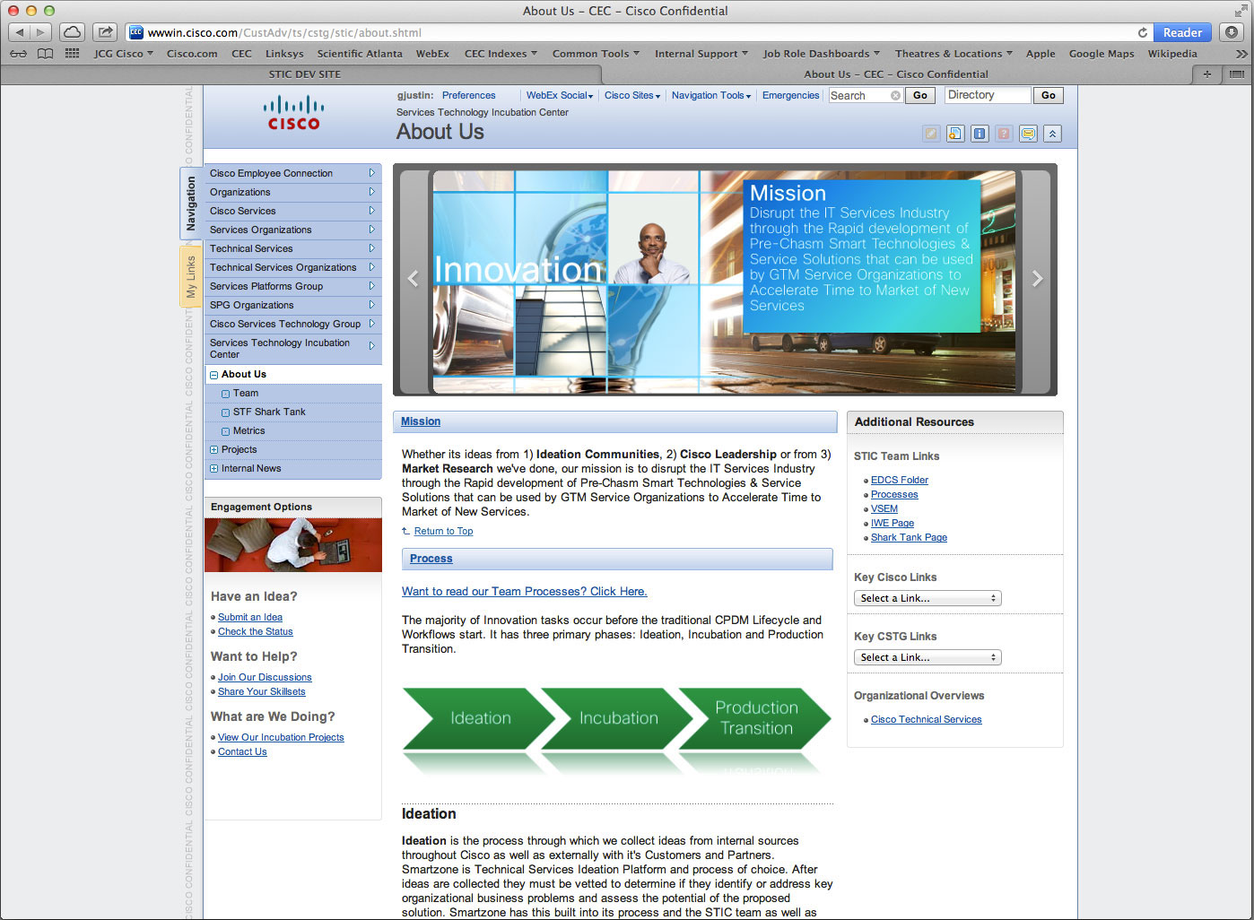
Old STIC ABOUT US page where services, mission statement, and application was merged. This made it confusing to the audience.
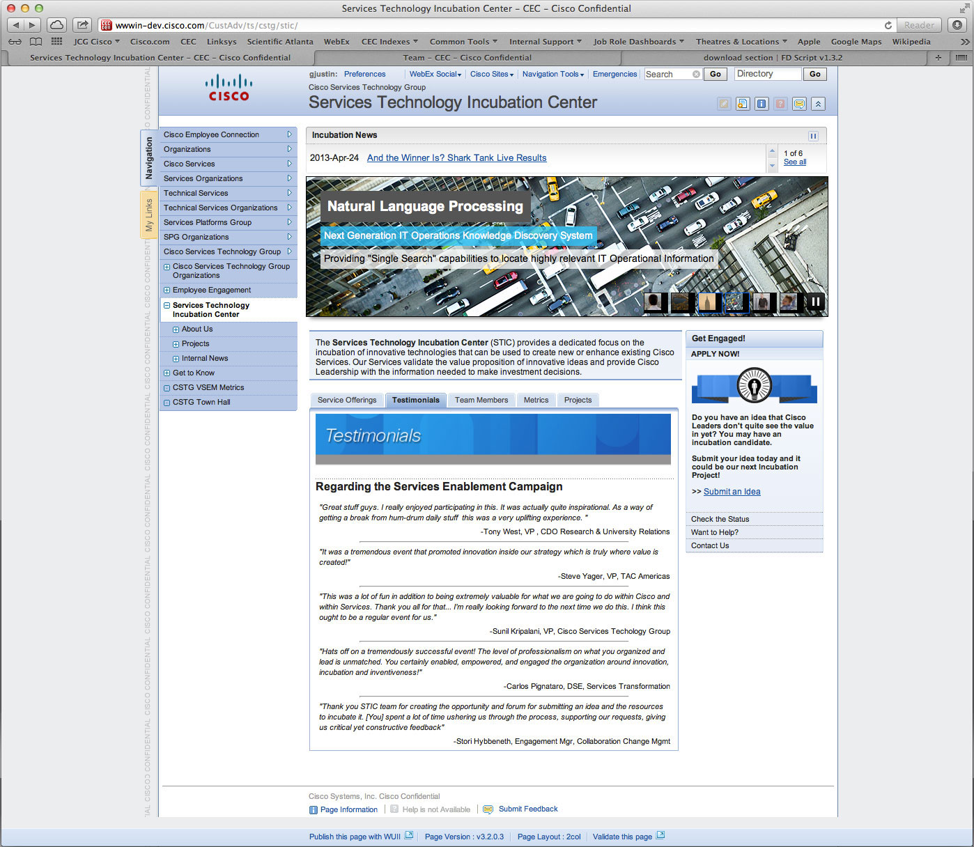
New STIC ABOUT US grouped and easy to read. I added a TESTIMONIAL section to highlight what the STIC group contributes to the larger CISCO organiztion.
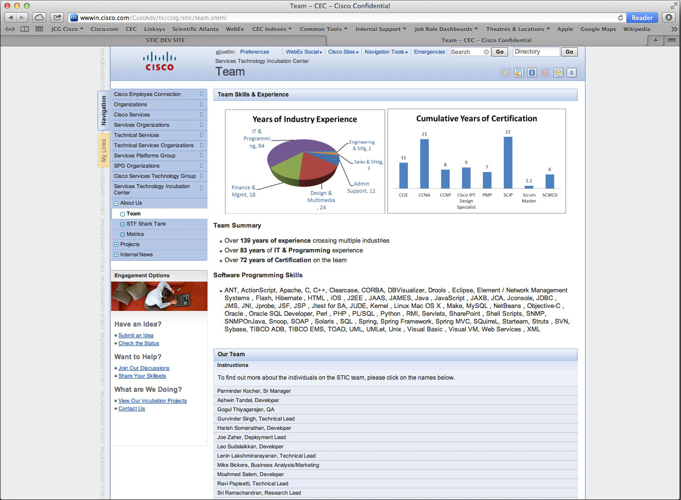
Old STIC TEAM page
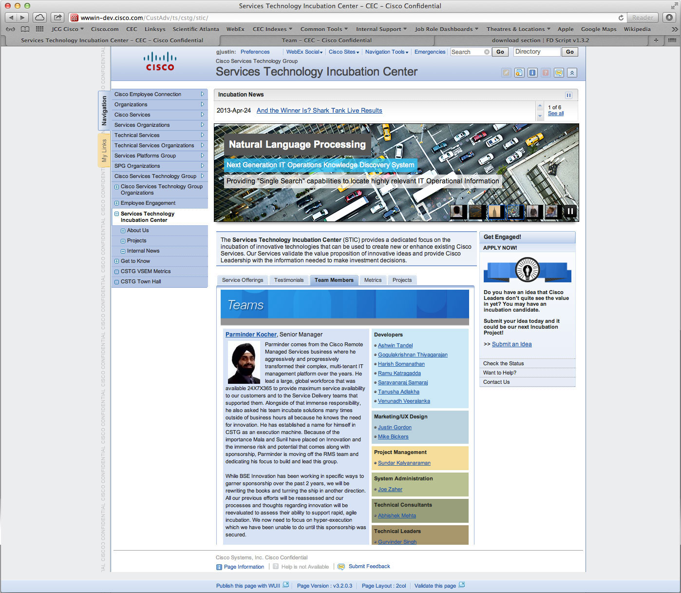
New TEAM PAGE serves as both an ORG Chart and contact information.
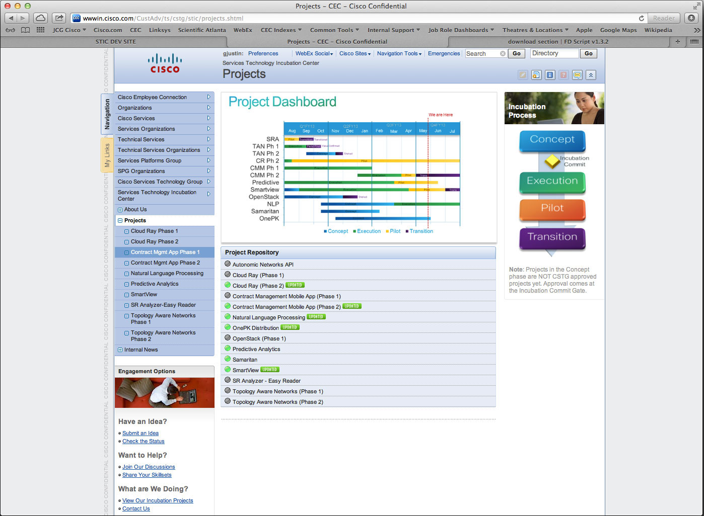
Old STIC PROJECT page requires drilling to see what the project is and what stage it is in.
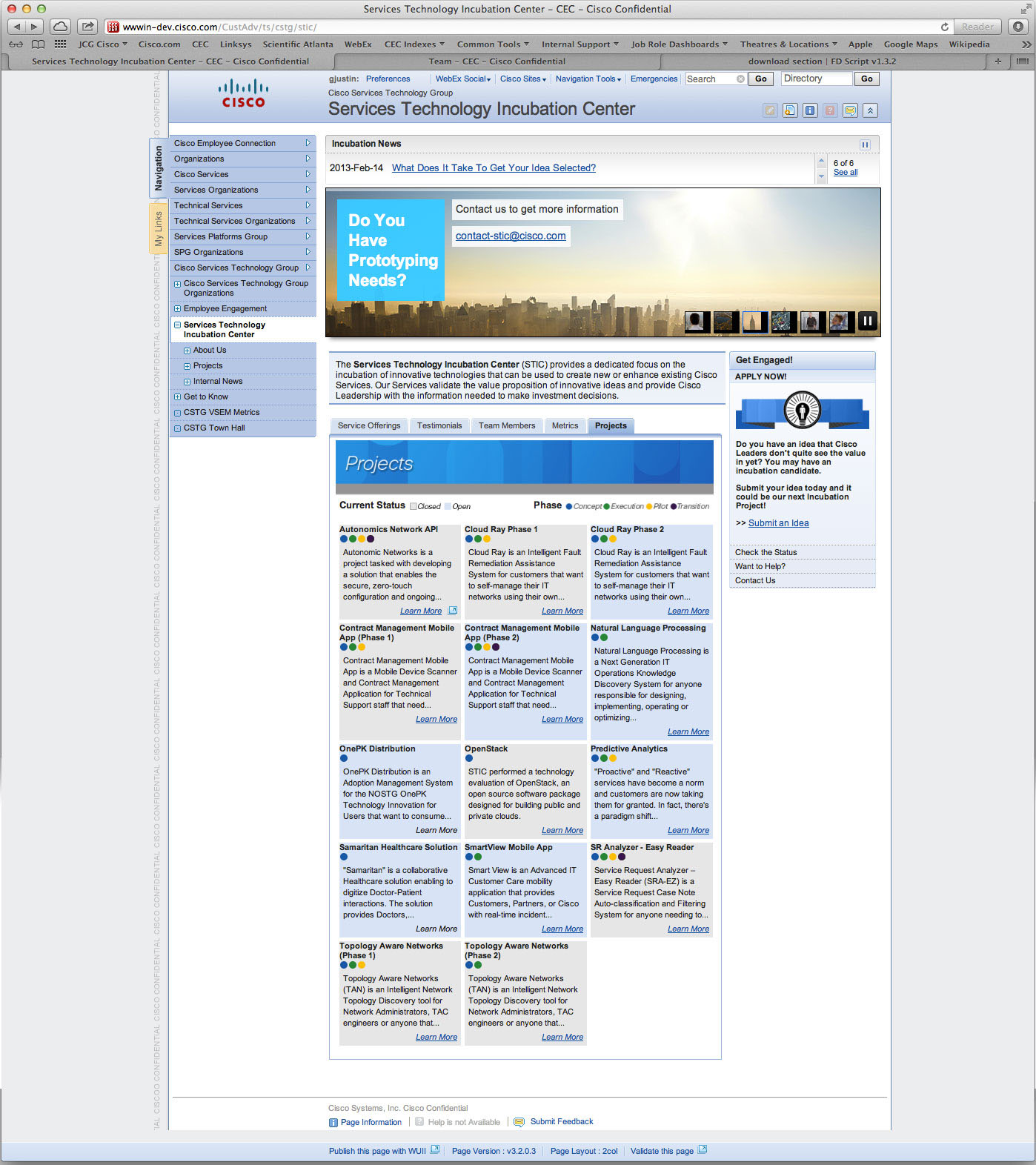
New PROJECT page as a grid with color codex for project stage.
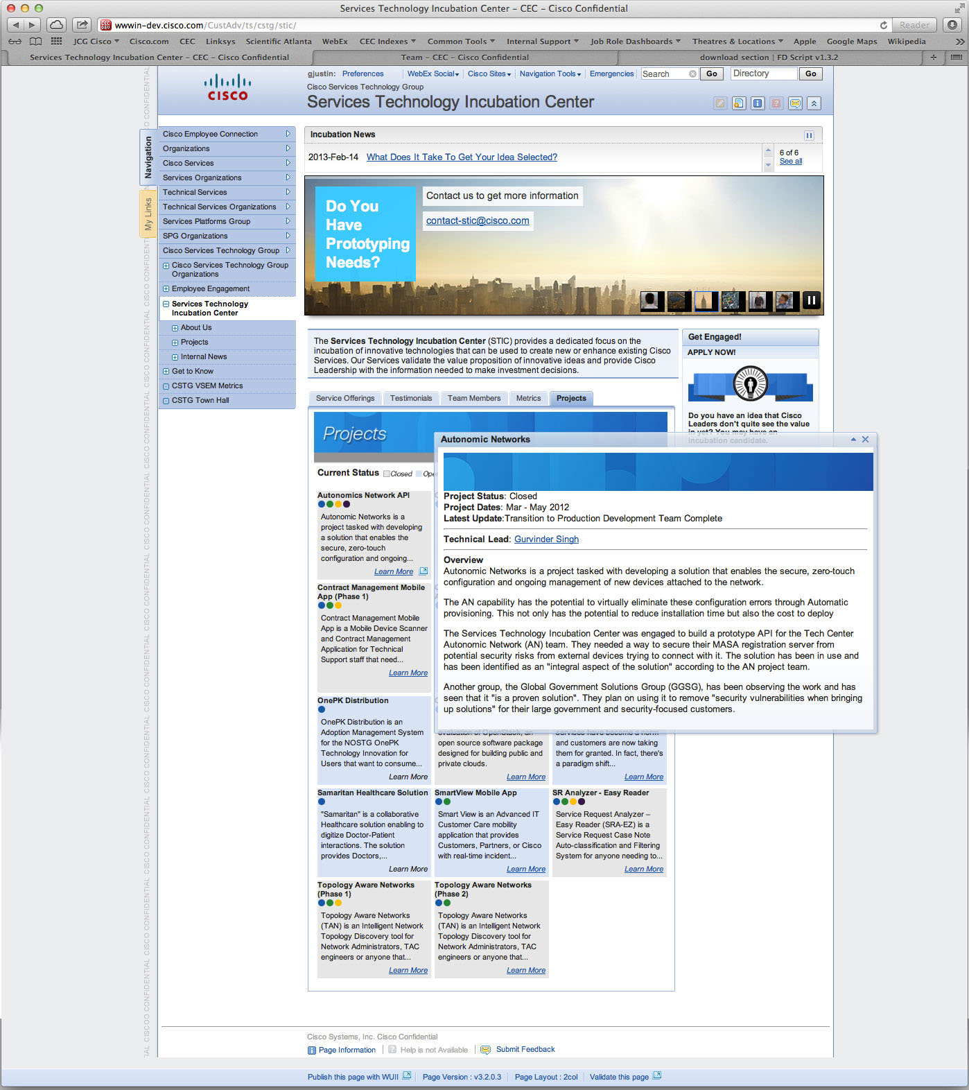
Each project breaks out of the grid, includes summary, and who is the contact for each.